Freelance designer with a focus
on identity, culture and digital. Based between Manchester and Leeds.
Freelance designer with a focus on identity, culture and digital. Based between Manchester and Leeds.
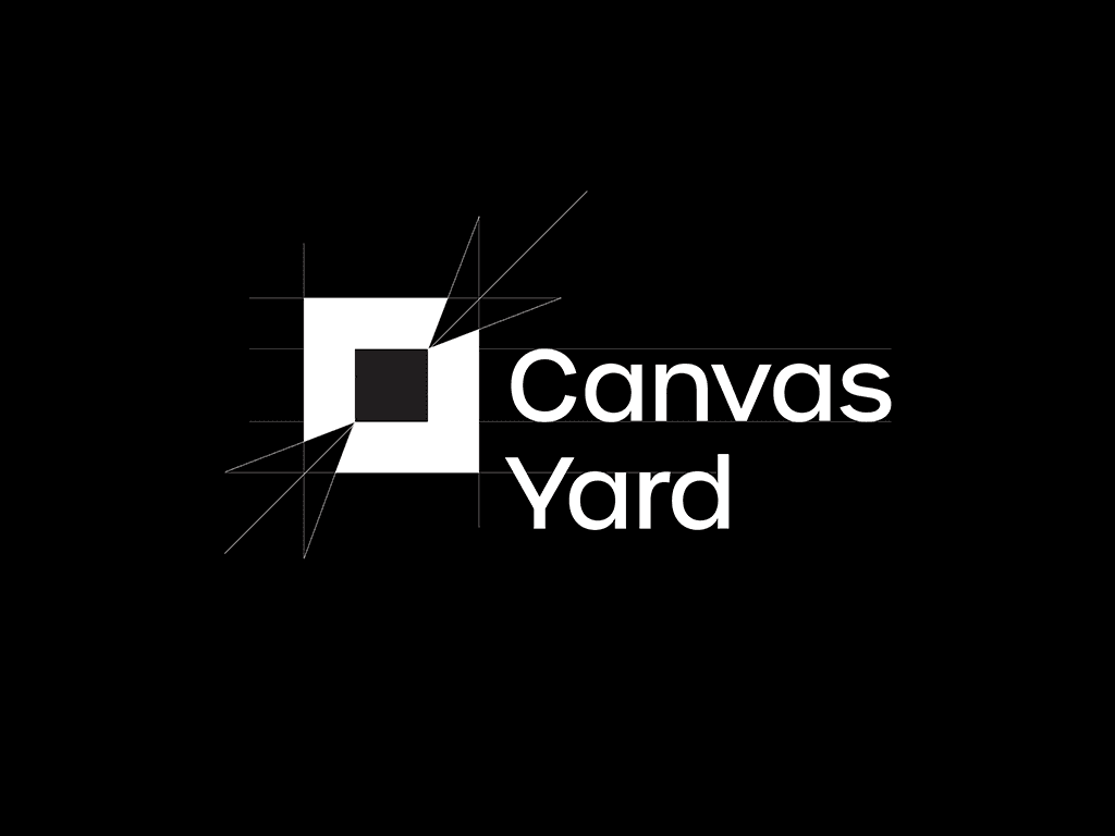
Canvas Yard
,
Identity
,
2023
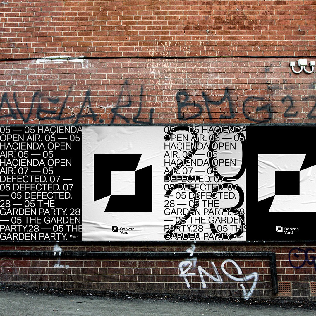
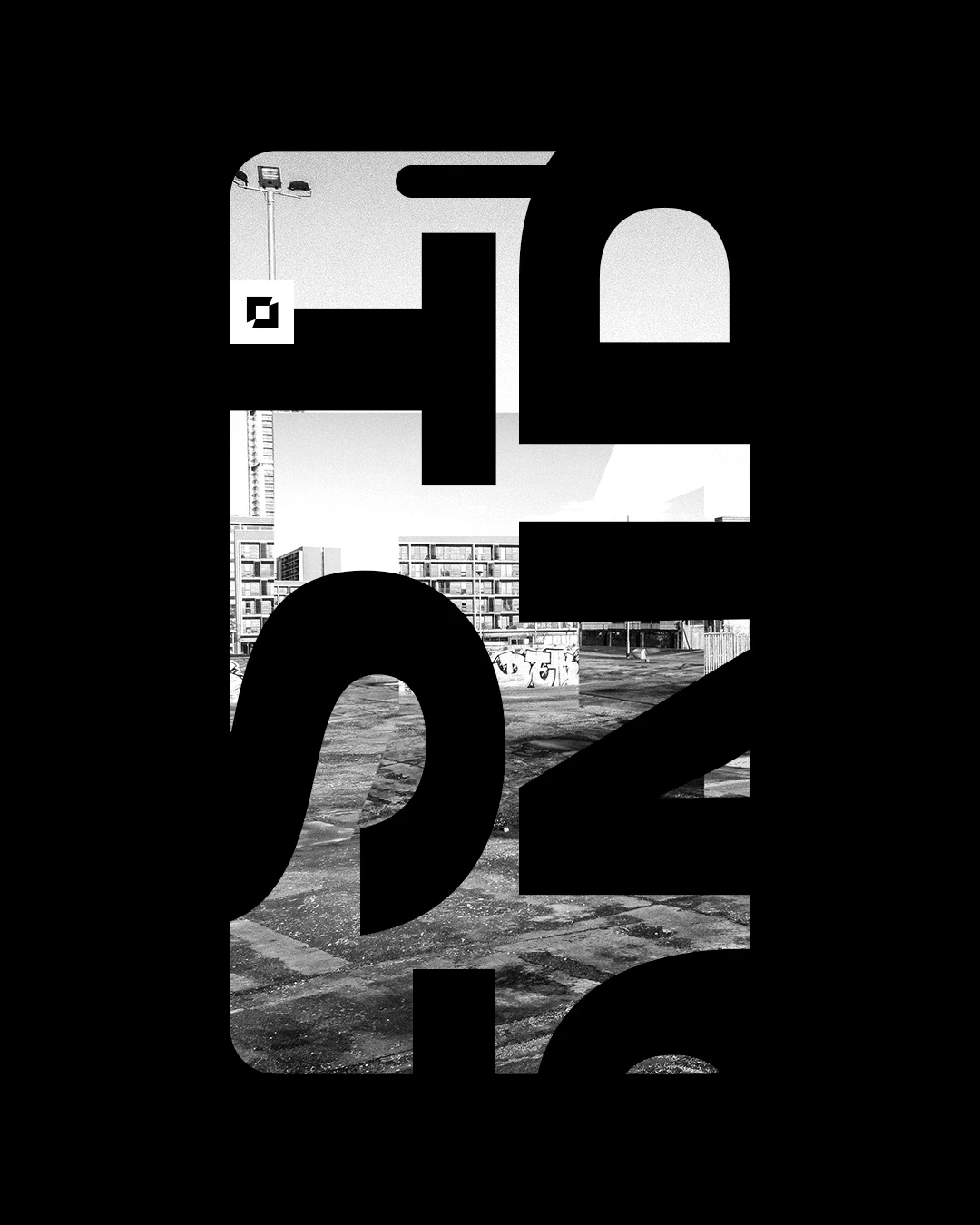
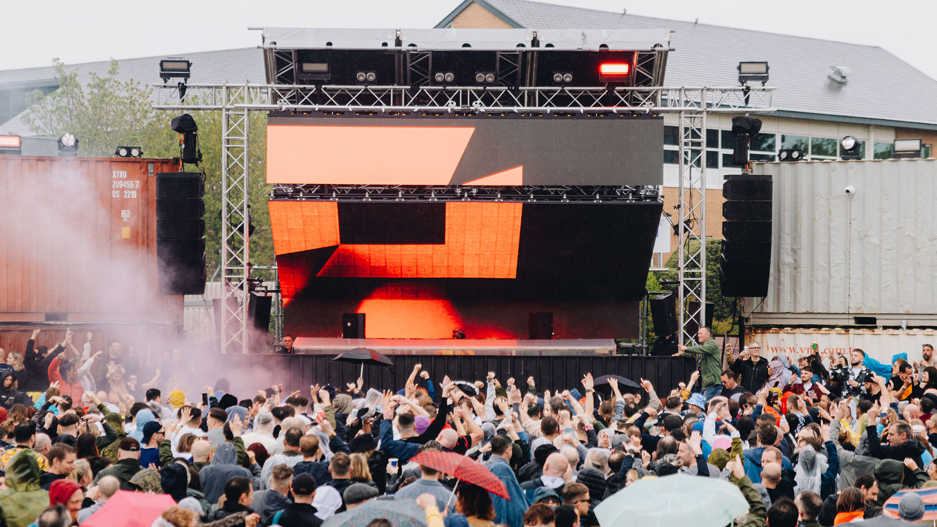
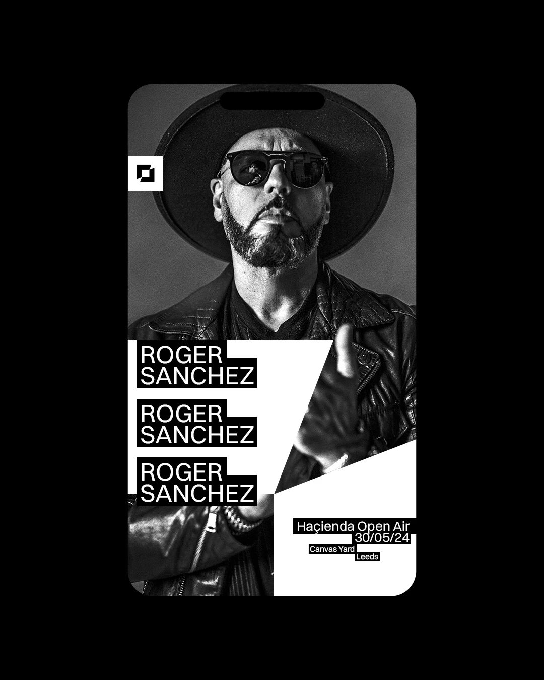
— Brief A 103,000 sqft blank space in Leeds city centre was being prepped for a run of large-scale summer shows across 2023 and 2024. The identity needed to feel bold and confident, while remaining versatile enough to sit alongside major brands like Defected, The Garden Party and Haçienda. — Approach The logo is built around a white square — a symbol of the site before activation. Framed by angular elements inspired by canvas keys, the mark hints at creative potential and change. These shapes subtly form arrows, drawing the eye inward to represent the return of energy, people and culture. The wordmark is carefully aligned and proportioned to reinforce clarity, order and purpose.
CY_01.mp4
CY_LOGO_02.MP4
CY_ooh.JPG
CY_04.JPG
CY_Live_05.JPG
NMD_06.MP4
CY_07.JPG
CY_08.JPG
Canvas Yard
,
Identity
,
2023
— Brief A 103,000 sqft blank space in Leeds city centre was being prepped for a run of large-scale summer shows across 2023 and 2024. The identity needed to feel bold and confident, while remaining versatile enough to sit alongside major brands like Defected, The Garden Party and Haçienda. — Approach The logo is built around a white square — a symbol of the site before activation. Framed by angular elements inspired by canvas keys, the mark hints at creative potential and change. These shapes subtly form arrows, drawing the eye inward to represent the return of energy, people and culture. The wordmark is carefully aligned and proportioned to reinforce clarity, order and purpose.
CY_01.mp4
CY_LOGO_02.MP4
CY_ooh.JPG
CY_04.JPG
CY_Live_05.JPG
NMD_06.MP4
CY_07.JPG
CY_08.JPG
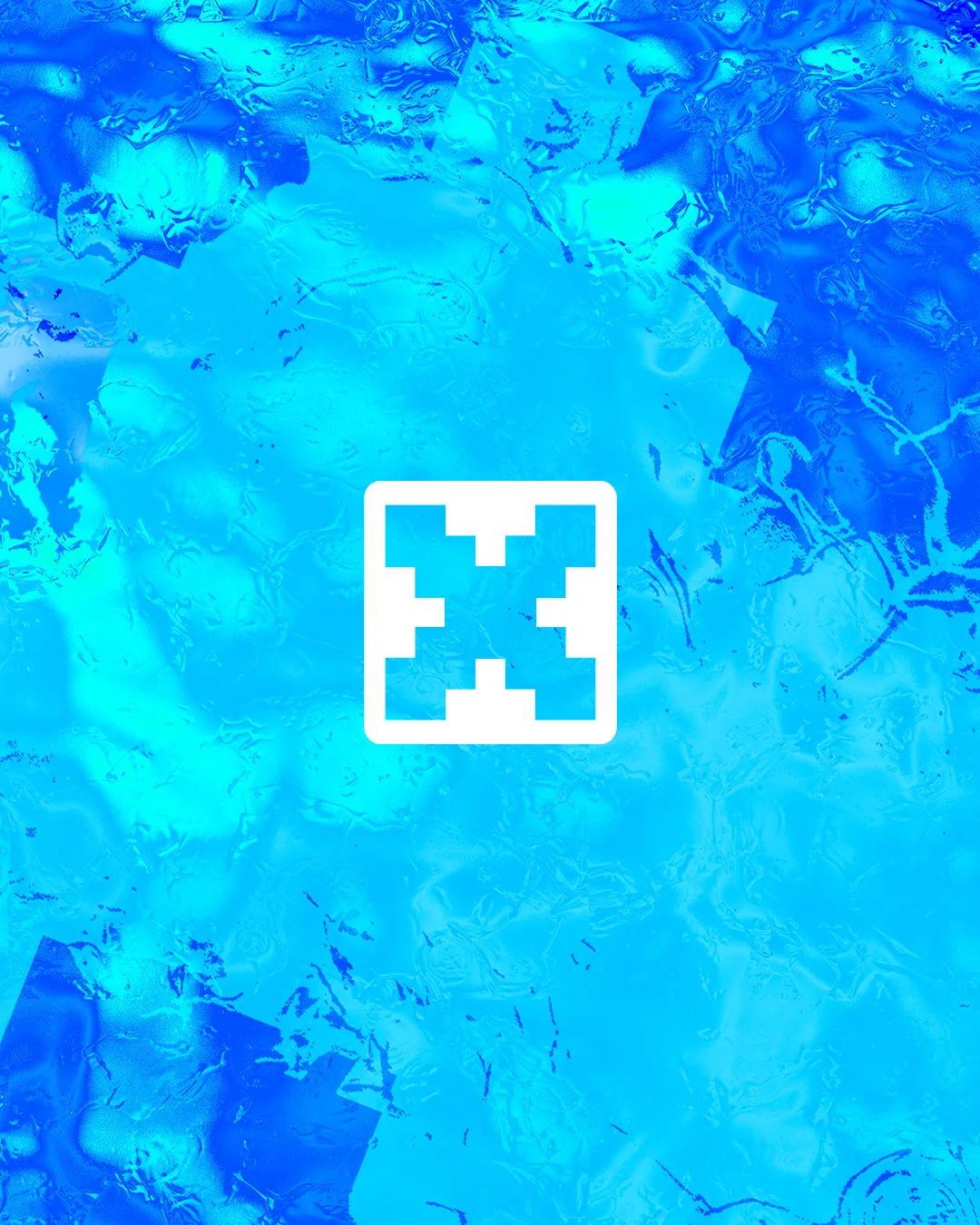
Hideout
,
Identity
,
2025
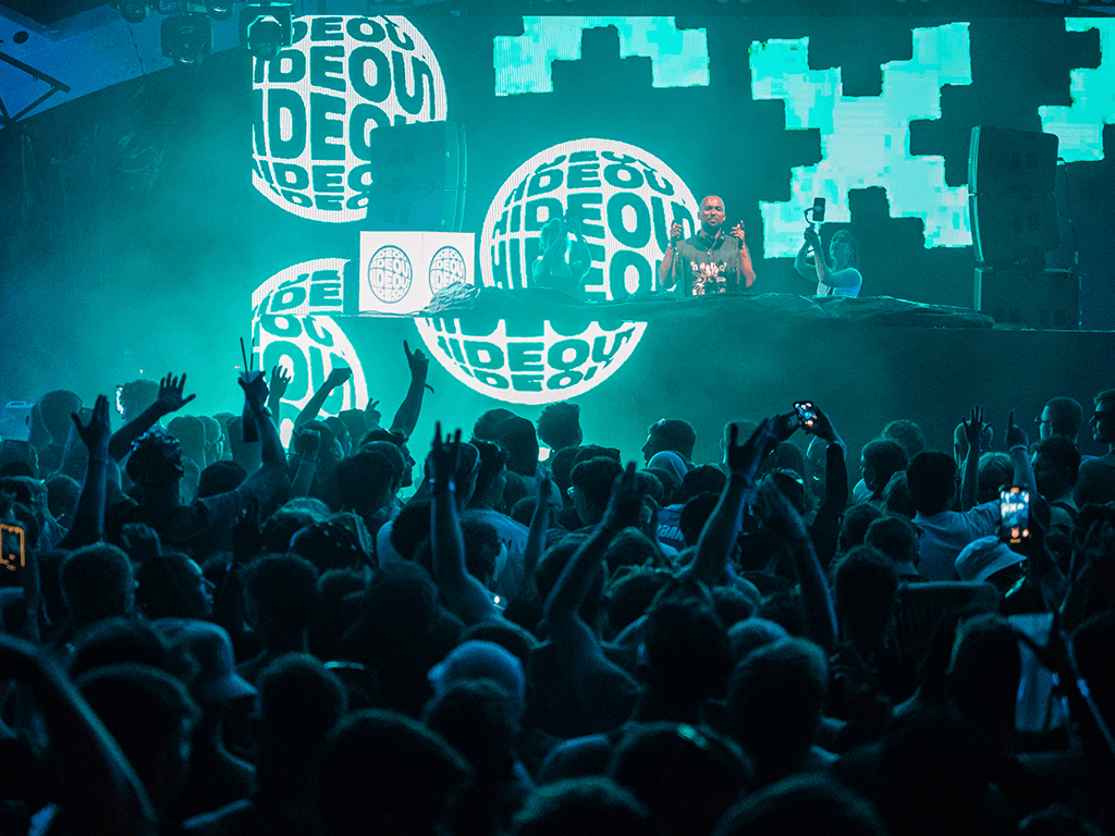
— Brief For its 15th anniversary, Hideout Festival sought a refreshed visual direction—one that stayed rooted in the core brand but felt re-energised for 2025. — Approach Building on the 2024 deconstructed logo, the concept pushed further into the environment—this time drawing from the festival’s coastal setting. The ‘X’ mark was submerged and reinterpreted through distorted, refracted water forms. A stripped-back palette brought clarity and cohesion, with the resulting assets forming the foundation of a full campaign rollout—across print, digital, and on-site visuals.
HO_1.jpg
HO_X.mp4
HO_DISPLACE.MP4
HO_SOCIAL.MP4
HO_BRANDBOOK.MP4
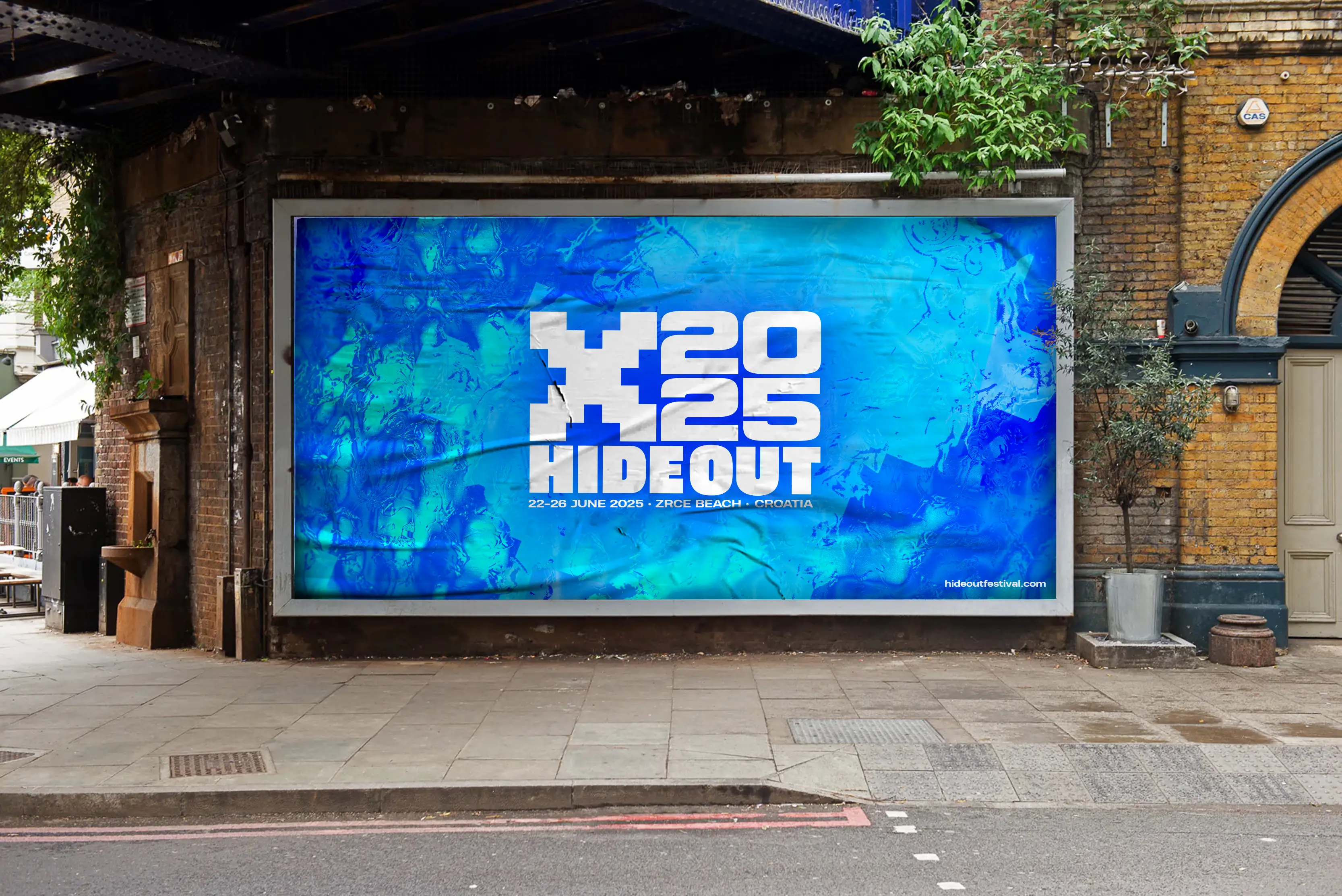
HO_OOH.jpg
HO_CLOTHING.Jpg
HO_SITE CREATIVE.JPG
Hideout
,
Identity
,
2025
— Brief For its 15th anniversary, Hideout Festival sought a refreshed visual direction—one that stayed rooted in the core brand but felt re-energised for 2025. — Approach Building on the 2024 deconstructed logo, the concept pushed further into the environment—this time drawing from the festival’s coastal setting. The ‘X’ mark was submerged and reinterpreted through distorted, refracted water forms. A stripped-back palette brought clarity and cohesion, with the resulting assets forming the foundation of a full campaign rollout—across print, digital, and on-site visuals.
HO_1.jpg
HO_X.mp4
HO_DISPLACE.MP4
HO_SOCIAL.MP4
HO_BRANDBOOK.MP4
HO_OOH.jpg
HO_CLOTHING.Jpg
HO_SITE CREATIVE.JPG
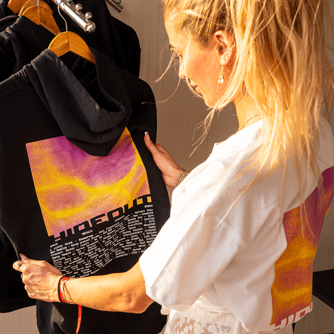
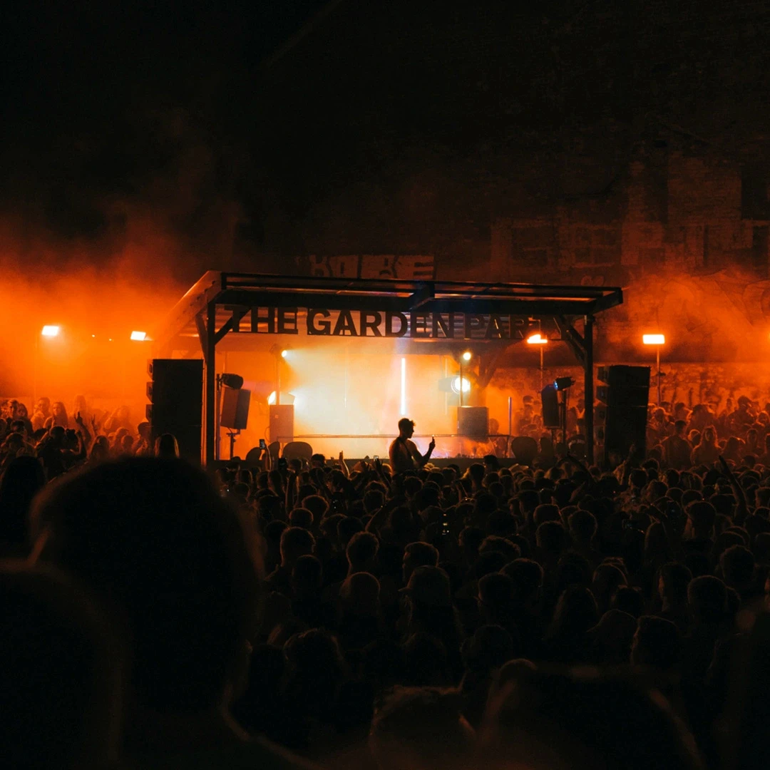
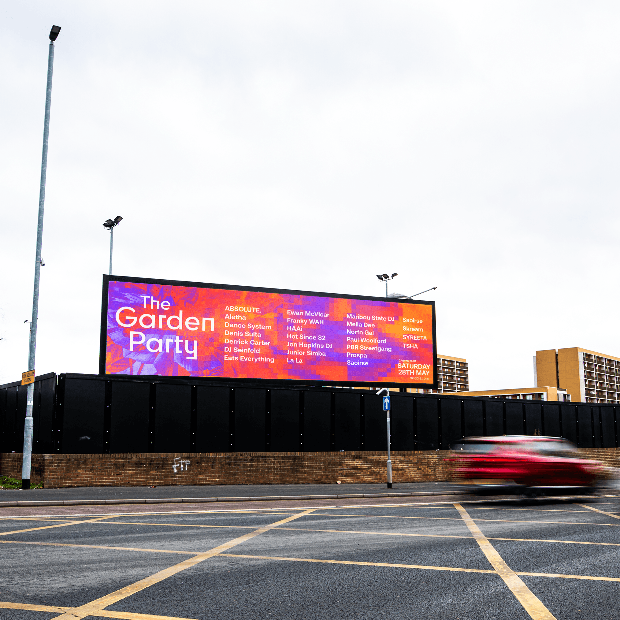
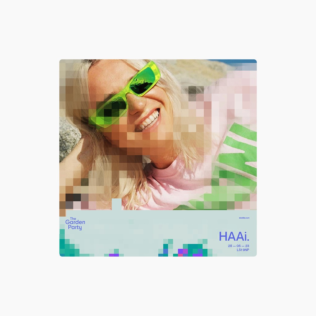
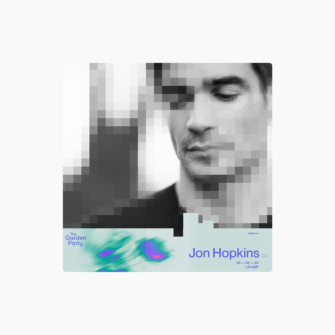
The Garden Party
,
Identity
,
2023
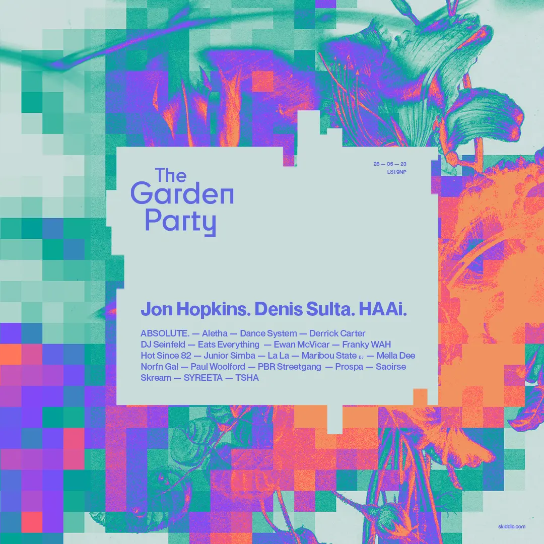
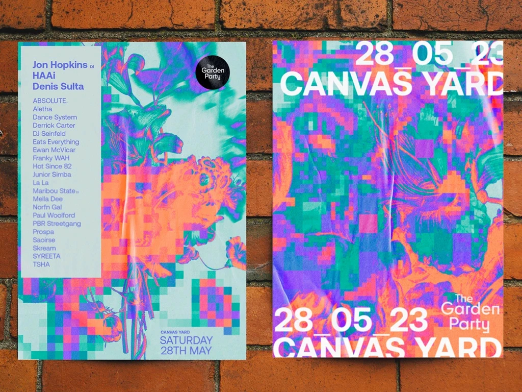
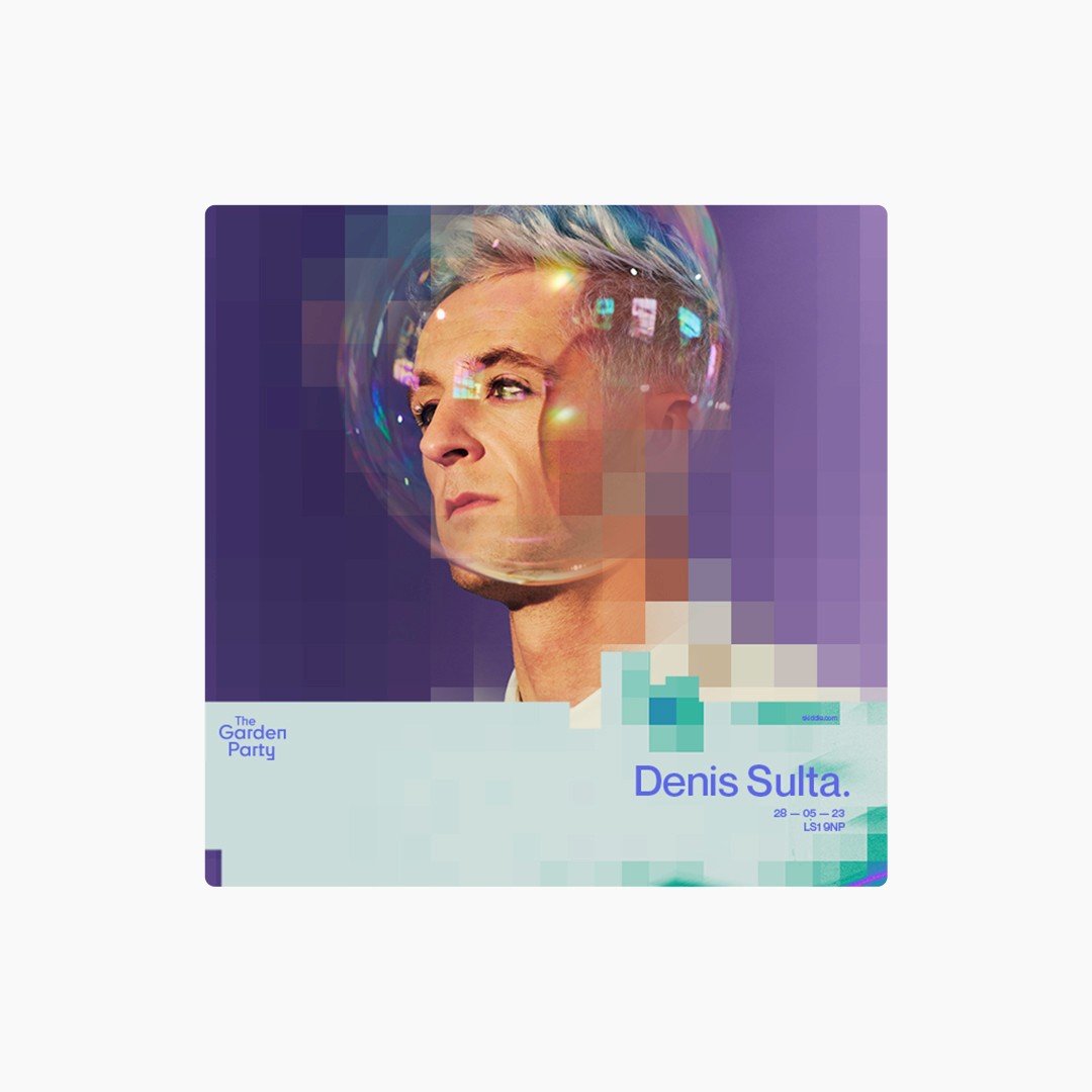
— Brief The Garden Party had outgrown its garden-party roots. Now in a 5,000-capacity industrial venue, the existing identity no longer fit the scale or energy of the event. The challenge: evolve the brand into a credible, future-facing festival while staying true to its original spirit — Approach The identity centres on a flexible core graphic — digitising nature. Found botanical illustrations nod to the festival’s origin, while digital pixelation distorts and provides a harsher edge, reflecting the festivals shift to a larger, grittier space. A visual tension between organic past and industrial present.
TGP_LINE UP_01.jpg
TGP_HEADLINER_02.mp4
TGP_OOH_03.jpg
TGP_SULTA_04.mp4
TGP_LIVE_05.jpg
TGP_OOH_06.jpg
TGP_haai_07.jpg
TGP_HOPKINS_08.jpg
TGP_MECHANICS_09.jpg
TGP_SLOW_HANDS_10.mp4
The Garden Party
,
Identity
,
2023
— Brief The Garden Party had outgrown its garden-party roots. Now in a 5,000-capacity industrial venue, the existing identity no longer fit the scale or energy of the event. The challenge: evolve the brand into a credible, future-facing festival while staying true to its original spirit — Approach The identity centres on a flexible core graphic — digitising nature. Found botanical illustrations nod to the festival’s origin, while digital pixelation distorts and provides a harsher edge, reflecting the festivals shift to a larger, grittier space. A visual tension between organic past and industrial present.
TGP_LINE UP_01.jpg
TGP_HEADLINER_02.mp4
TGP_OOH_03.jpg
TGP_SULTA_04.mp4
TGP_LIVE_05.jpg
TGP_OOH_06.jpg
TGP_haai_07.jpg
TGP_HOPKINS_08.jpg
TGP_MECHANICS_09.jpg
TGP_SLOW_HANDS_10.mp4
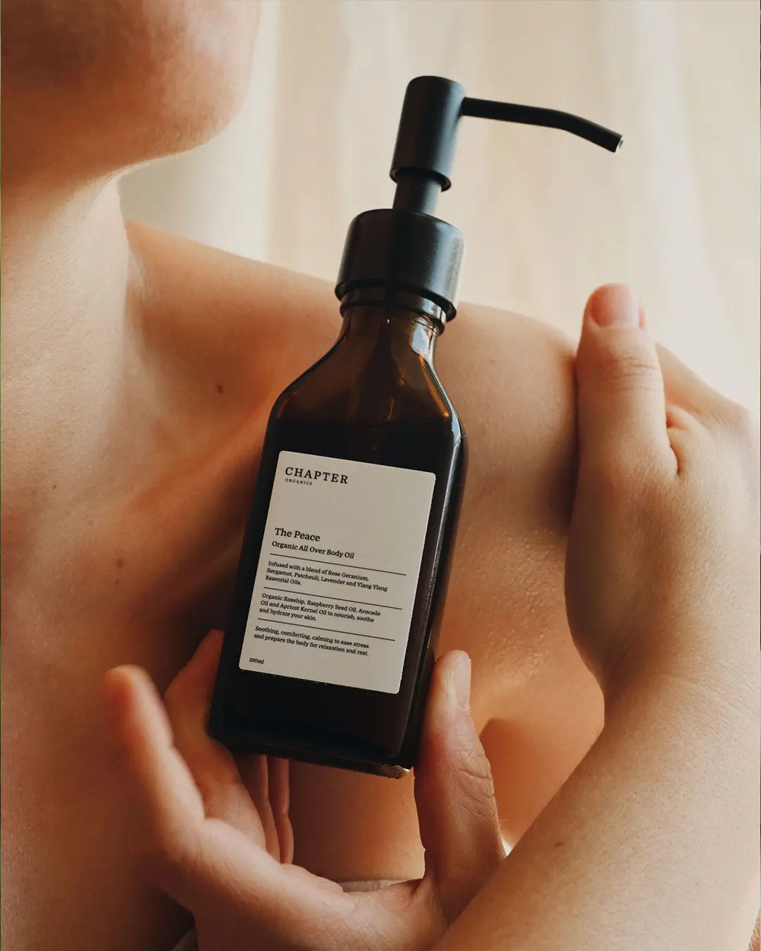
Chapter Organics
,
Packaging
,
2025
— Brief Chapter Organics needed a calm, sustainable identity that still felt premium enough for style conscious customers. — Approach Whitespace, muted tones, and crisp type let the products—and the space around them—breathe. A modular label grid unifies five ranges across every bottle, delivering quiet consistency and understated luxury.
CO_01.JPG
CO_SPACE_02.JPG

CO_03.JPG
CO_SYSTEM_04.MP4

CO_05.JPG
CO_BOTTLE_06.JPG
CO_BROCHURE_07.MP4

CO_08.JPG

CO_09.JPG
Chapter Organics
,
Packaging
,
2025
— Brief Chapter Organics needed a calm, sustainable identity that still felt premium enough for style conscious customers. — Approach Whitespace, muted tones, and crisp type let the products—and the space around them—breathe. A modular label grid unifies five ranges across every bottle, delivering quiet consistency and understated luxury.
CO_01.JPG
CO_SPACE_02.JPG
CO_03.JPG
CO_SYSTEM_04.MP4
CO_05.JPG
CO_BOTTLE_06.JPG
CO_BROCHURE_07.MP4
CO_08.JPG
CO_09.JPG
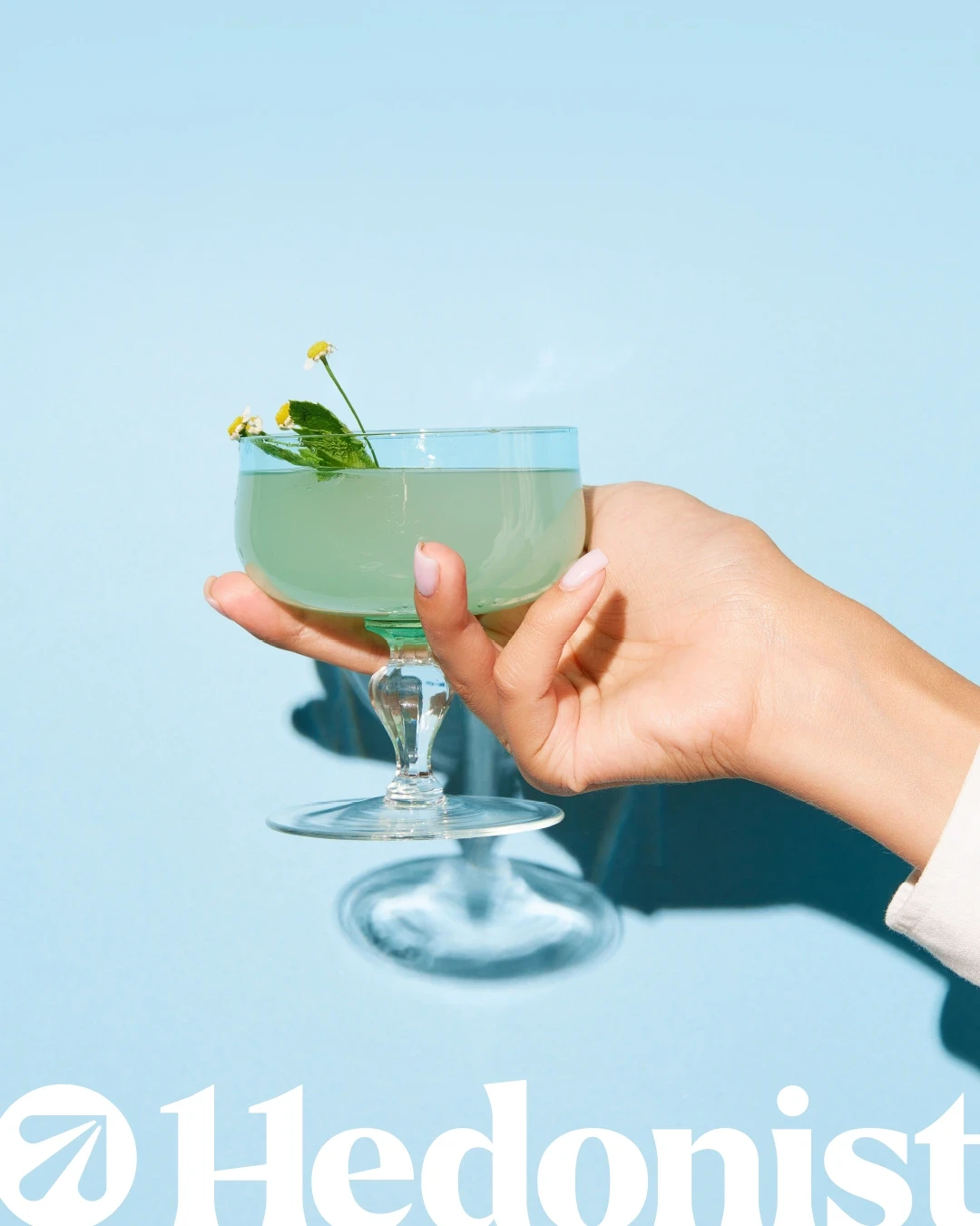
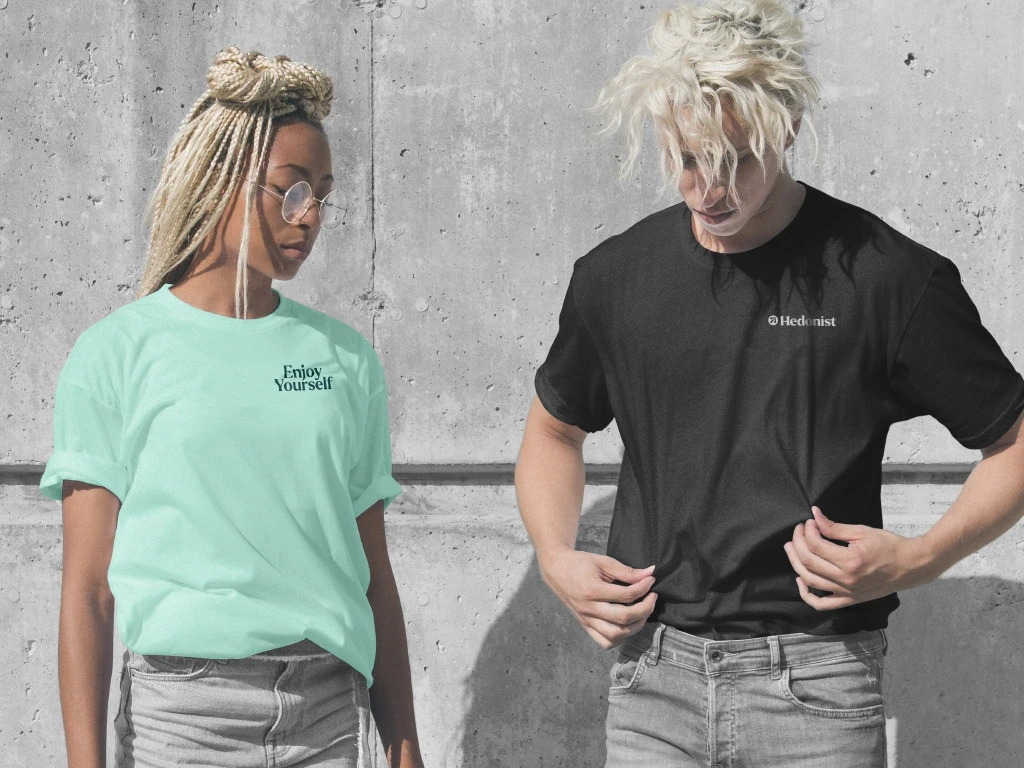
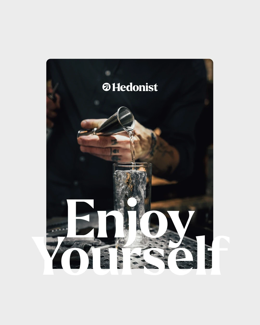
Hedonist
,
Identity
,
2024
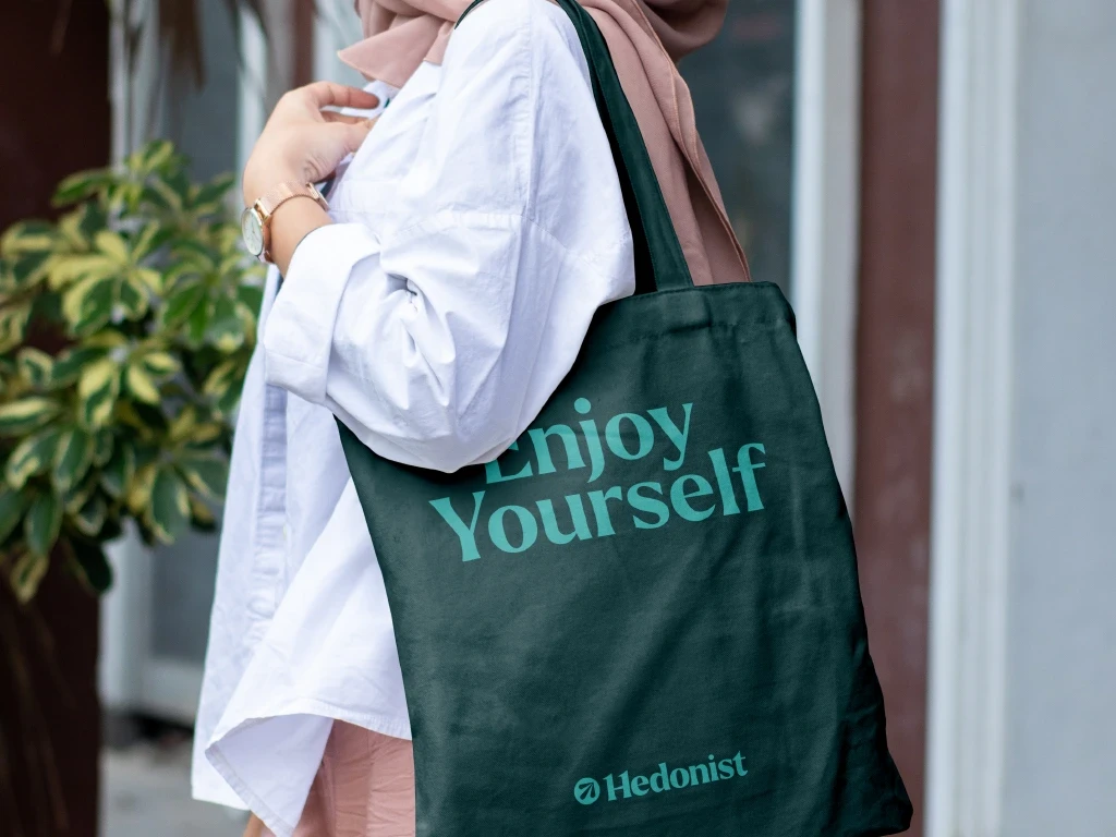
— Brief As Hedonist grew beyond its Leeds roots, it needed a more refined identity — one that balanced creativity with strategy. The aim was to introduce character and add polish for a broader, high-end audience. — Approach The rebrand leaned into the name — a celebration of pleasure. A curved arrow logo symbolised pursuit and joy and represented the newly streamlined three strands of the business, while the 'H' in the wordmark carried hidden nods to the 11 Hydrogen atoms found in dopamine. Every detail added richness, intimacy, and intent — a brand built to feel both playful and elevated.

HDNST_01.JPG
HDNST_BOOK_02.MP4
HDNST_03.jpg
H_EDIT_04.MP4
HDNST_05.MP4
HDNST_CLOTHING_06.JPG
HDNST_PERSUIT_07.MP4
HDNST_ENJOY_08.jpg
HDNST_09.JPG
HDNST_CARD_10.JPG
Hedonist
,
Identity
,
2024
— Brief As Hedonist grew beyond its Leeds roots, it needed a more refined identity — one that balanced creativity with strategy. The aim was to introduce character and add polish for a broader, high-end audience. — Approach The rebrand leaned into the name — a celebration of pleasure. A curved arrow logo symbolised pursuit and joy and represented the newly streamlined three strands of the business, while the 'H' in the wordmark carried hidden nods to the 11 Hydrogen atoms found in dopamine. Every detail added richness, intimacy, and intent — a brand built to feel both playful and elevated.
HDNST_01.JPG
HDNST_BOOK_02.MP4
HDNST_03.jpg
H_EDIT_04.MP4
HDNST_05.MP4
HDNST_CLOTHING_06.JPG
HDNST_PERSUIT_07.MP4
HDNST_ENJOY_08.jpg
HDNST_09.JPG
HDNST_CARD_10.JPG